Member-only story
Mastering Responsive UIs in Flutter: The Full Guide
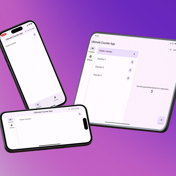
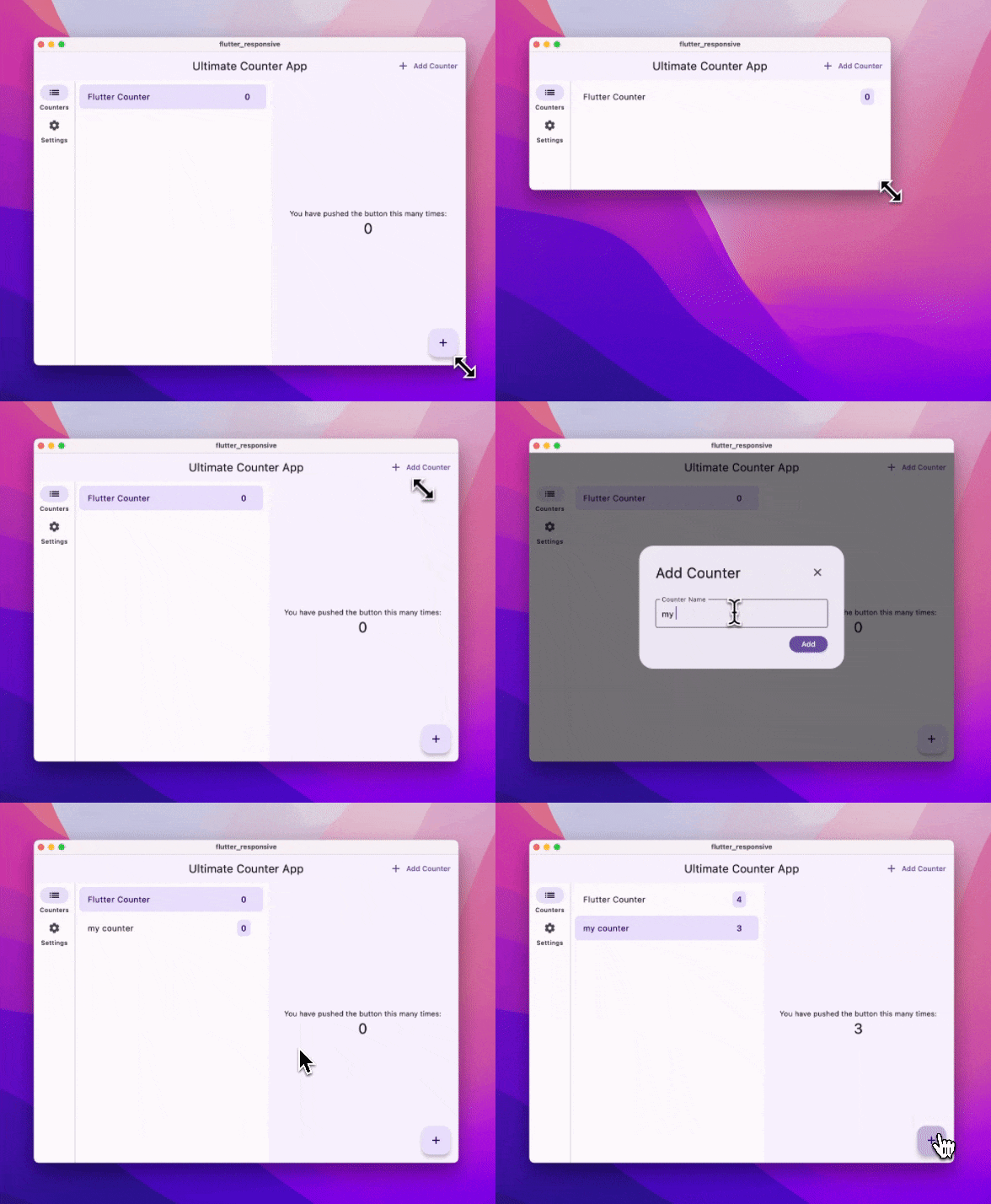
Flutter has become a go-to framework for developing cross-platform apps, but the real challenge lies in making these apps responsive across a variety of devices. This article is all about mastering the world of Flutter to ensure your app looks and works great, whether on mobile, desktop, or web.
I was thrilled to see the community’s enthusiastic response and the many insightful questions, when I released my first short guide on Building Responsive UIs. So, I’ve put together this detailed follow-up to tackle all those burning questions. Whether you’re just starting out or looking to improve your UI skills, this guide’s got you covered!
If you still have any questions, feedback, or suggestions, feel free to reach out to me on X/Twitter.
Side Note: This guide avoids using additional packages. However, I recommend using at least a state management solution like Riverpod or Bloc to manage your app’s state effectively. To keep this guide simple we will use the build in API ChangeNotifier to update the UI.
REPOSITORY: GitHub

Introduction
Flutter’s versatility allows developers to target a wide range of platforms including iOS, Android, Web, Desktop, and Linux. However, embracing this wide platform support introduces challenges such as:
- Handling different form factors and types: Phones, tablets, foldables, desktops, web interfaces, smartwatches, TVs, cars, smart displays, IoT, AR, VR, etc.
- Addressing notches, cutouts, punch holes.
- Scaling UI and text; ensuring accessibility.
- Supporting both RTL (Right-to-Left) and LTR (Left-to-Right) text directions and different type of fonts.
❓ Do you need to support all these devices?
It’s important to understand your app’s requirements and the target audience before diving into responsive design. Also consider the trade-offs and the additional effort required to support each platform. But with the right approach and setup you can build apps that look great on any device.
