Member-only story
Building Responsive UIs in Flutter: A Short Guide
I’ve released a detailed follow-up guide which goes into much more details: https://dario-digregorio.medium.com/mastering-responsive-uis-in-flutter-the-full-guide-7e21acda614e
Flutter has become a go-to framework for developing cross-platform apps, but the real challenge lies in making these apps responsive across a variety of devices. This article is all about navigating the world of Flutter to ensure your app looks and works great, whether on mobile, desktop, or web.
Side Note: This guide sticks to the basics of Flutter for responsiveness, avoiding additional packages.
The Tools I’m Using: For this, I’m working with Dart 3.1.3, Flutter 3.13.9 and optional Riverpod 2.4.5.
Setting Up and Key Insights
Testing your layouts on different devices and platforms is crucial. Choose a development environment that allows easy resizing. Each platform has its nuances, so let’s explore them:
Understanding Platform and Device Differences
- Windows/MacOS/Web: These are the easiest for development. They offer flexible window resizing and support HotReload. However, Flutter Web doesn’t support HotReload. Also,
MediaQuery.orientationOf()here is based on window size, not device orientation. - MacOS (Designed for iPad): Optimize your app for both iOS and MacOS with the ‘My Mac (Designed for iPad)’ target in Xcode. This special build allows you to create an iOS-optimized app that functions seamlessly on MacOS. It behaves like a native MacOS app while maintaining compatibility with libraries used in the iOS version. This approach offers a unified development process for both platforms, ensuring that your app delivers a consistent experience across Apple devices. There is still some work to set it up properly. See this issue.
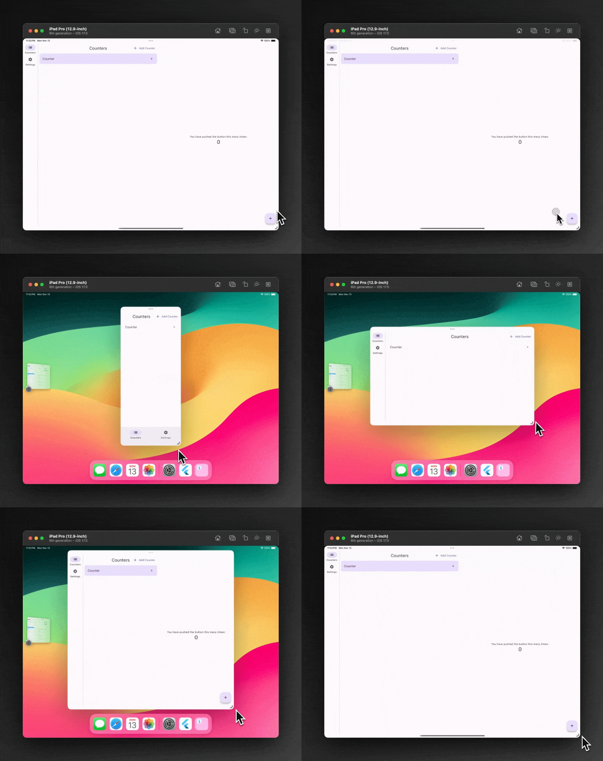
- iPad with Stage Manager: If your dependencies limit your platform choice, an iPad with Stage Manager is a good option. It allows resizing within predefined screen sizes.

- Android: The Android Resizable…
